
The core brand idea is a ‘Window to the World’.


BBC Earth Rebrand
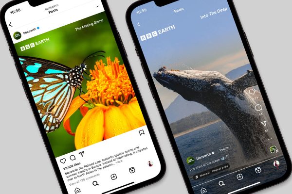
Essentially an umbrella brand for BBC Studios’ natural history and science content, BBC Earth is dedicated to taking viewers on a thrilling journey of discovery, from the smallest creature under the microscope to the limitless expanses of space. The new brand refresh aims to further build on that mission by unveiling a bold new look and feel for its brand.
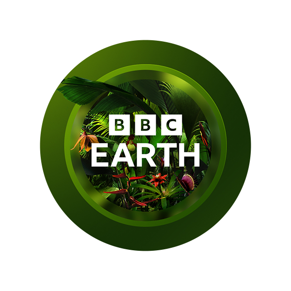
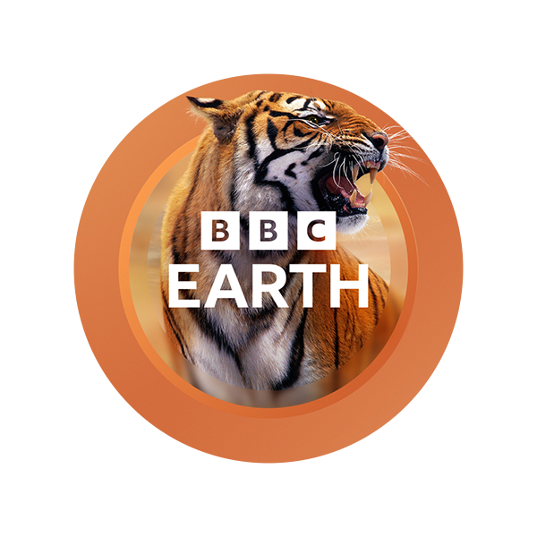
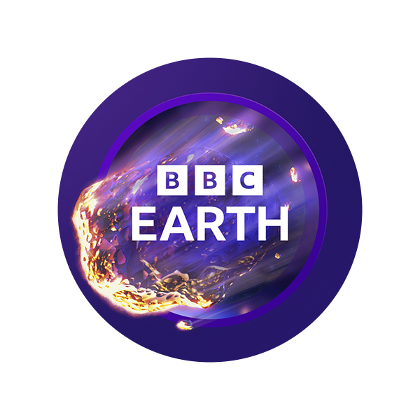
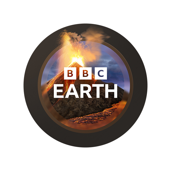
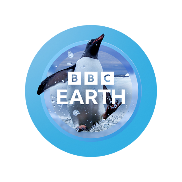
The main hero logo would be the iconic Green with green gradients and a variety of plant leaves which would represent environments like jungles, forests and green based areas like grasslands and wetlands. The other logos were developed to portray other biomes of the natural world. Orange gradients and a Tiger for Arid environments and wildlife, Deep blue gradients and Fish for underwater environments, Ice blue gradients and a Penguin for Arctic and Antartic biomes, Purple gradients and a Comet to represent Cosmic environments and finally Brown gradients and a Erupting Volcano to represent extreme ‘hostile to man’ earth environments.
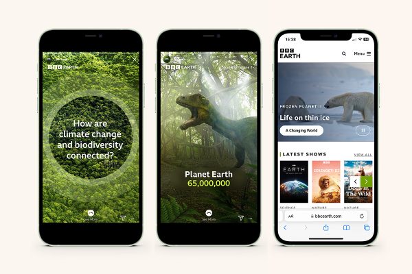
I helped the design team develop and artwork the final logo executions with standard single colour vectors, gradient and image based versions. As well as developing the guidelines document with visualisation of the brand executions throughout. Work involved included:
- Hi Res final artwork
- Design development of gradients and logos
- Implementation of artwork & guidelines
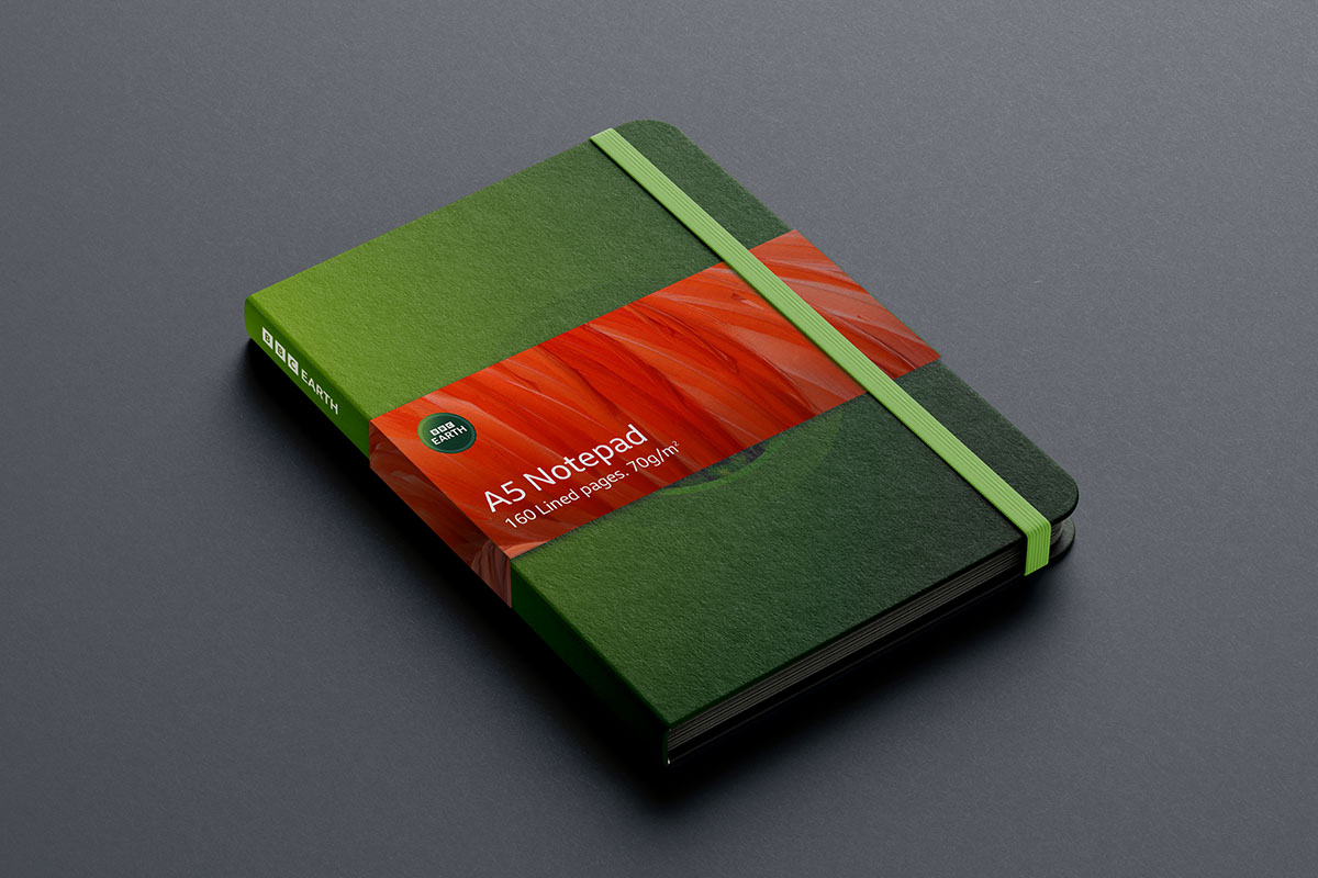
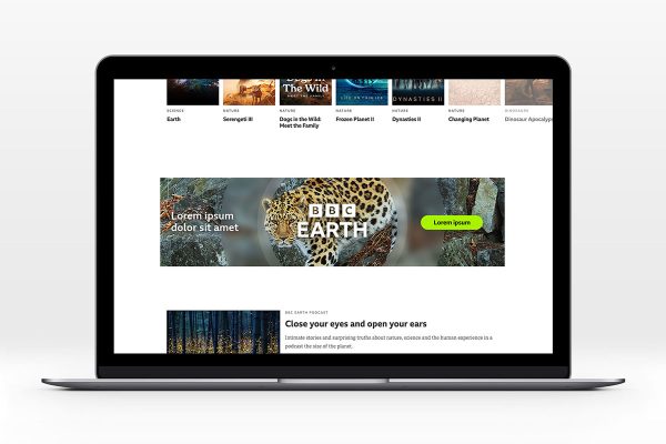
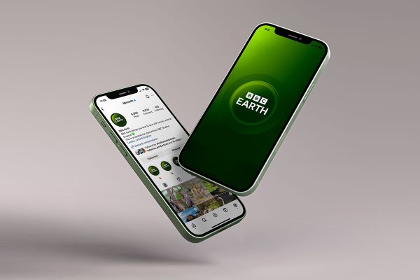
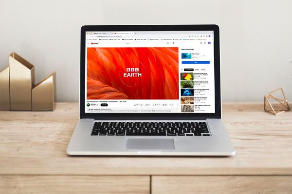
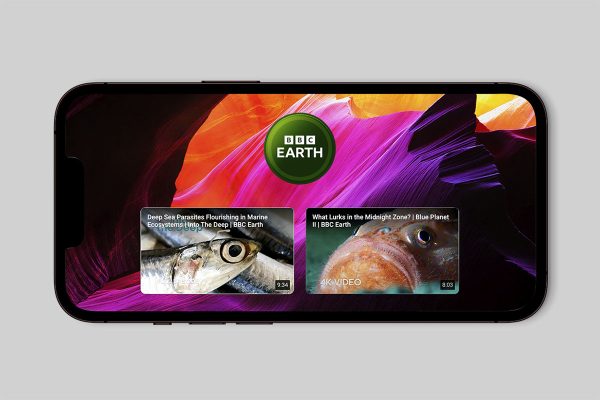
- Visualisation of the brand execution

BBC Earth TV Idents
Out of Home Visuals
Merchandise Visuals




Logo Variations








Showcase 2019
Showcase 2019

NatWest Guidelines
NatWest Guidelines

Land Rover Guidelines